Williams Winter
Redesigning a Melbourne legal institution ready for the next 150 years
Williams Winter
The Project
Williams Winter are an outstanding law firm celebrating 150 years as a Melbourne institution. Williams Winter were referred to us looking for a website redevelopment and brand refresh to take them into the next 150 years head on.


Our Strategy
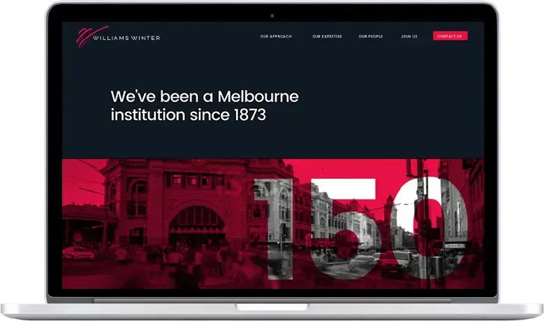
After talking with the Williams Winter partners we discovered their down to earth and comforting style so our strategy was to emphasise that style with a relaxed tone and Melbourne focussed site that celebrates their history and looks forward to the future of the firm. Reducing the amount of content and introducing a simplified navigation and workflow that guides clients through often unfamiliar terminology and processes was also important. We also produced a realignment of the Williams Winter brandmark to work in conjunction with the new site. The design is based on the pink ribbon that was traditionally tied around legal documents for court. We have emphasised the Williams Winter brand pink as a nod to the history of the firm and to create a recognisable brand colour that sets them apart from the competition.
Delivery
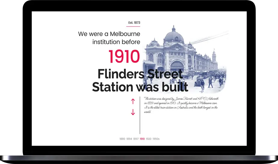
A Melbourne institution since 1873 became the theme for the site, complete with a interactive timeline highlighting the changes in Melbourne since the firm began in the pioneering days of Melbourne’s history. Heavy use of brand colours, combined with modern imagery and emphasis on team culture and the firms welcoming nature shine through. A new careers and graduate program section includes current opportunities integrated within the site, and calls to action guiding the client experience.

The Transformation
Slide the arrows to view the before and after transformation.


